Go back

UX/UI Designer (solo)
April – July 2025
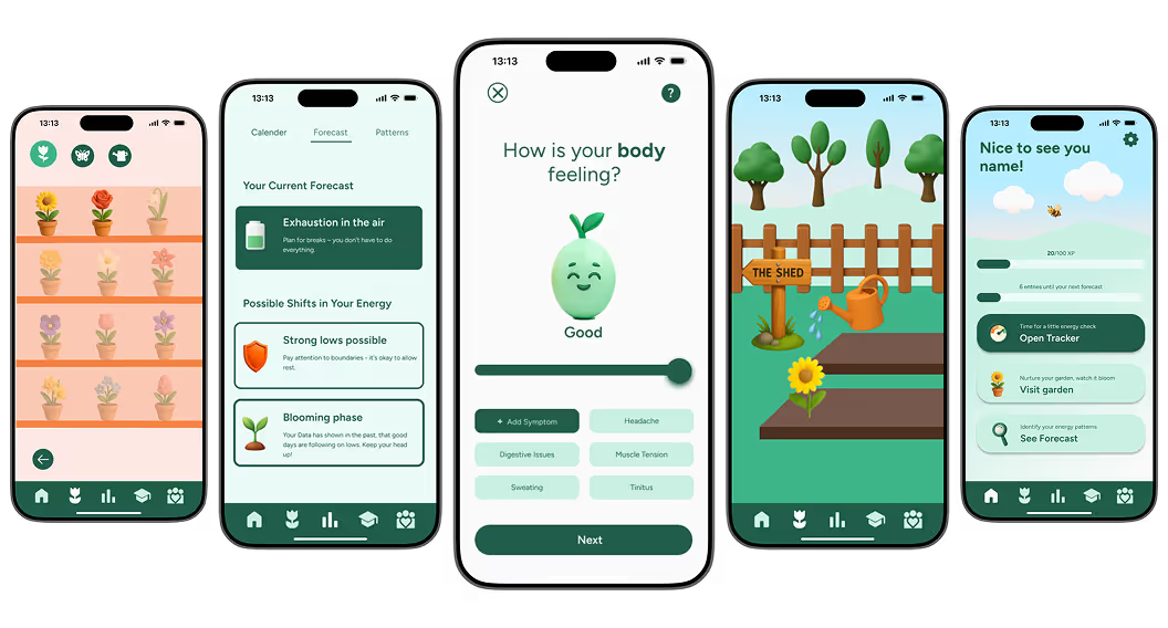
For people with chronic fatigue or other conditions that limit energy, everyday life can be unpredictable. Olive helps them manage their energy in a fun way. AI-powered insights, a simple 3-step tracker, and a personalized “energy garden” make progress visible—even when shared with friends. This case study recounts the journey from initial research to the finished prototype.
4/6
Users evaluate Tracker & Garden as motivating, without pressure
5/6
Users would use the app weekly or more
6/6
Users described the design as relaxing and emotional supportive and are interested in using the AI forecast in their daily life
🎯 The Challenge
People with chronic energy fluctuations struggle to track their energy because current apps are too effortful, stressful, or complex, leading to frustration and unreliable data. How might I create a compassionate, low-effort tracking experience that helps users recognize patterns without constant manual input and feels emotionally safe?
🛠️ The Approach
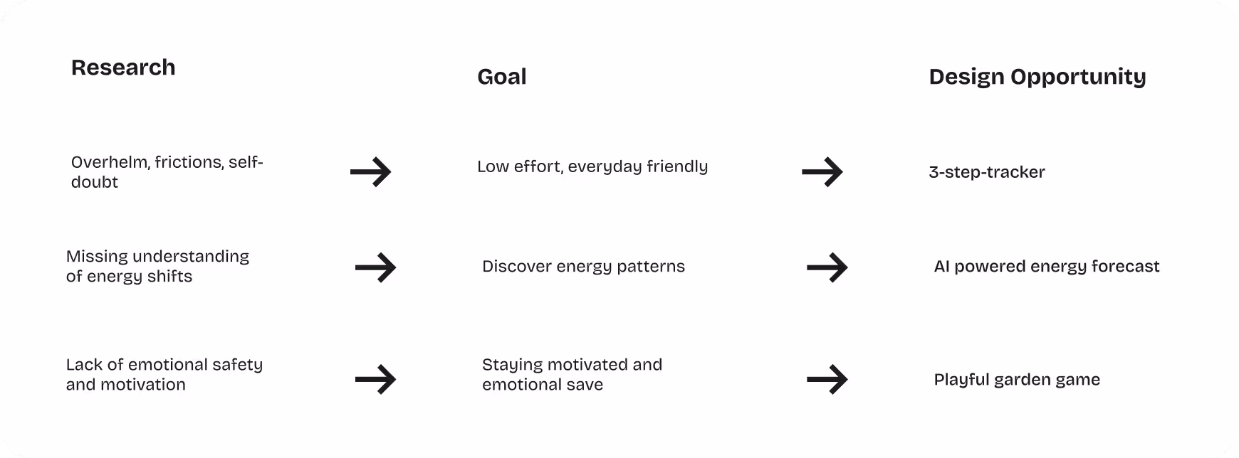
Qualitative interviews, a quantitative survey, affinity mapping, and empathy mapping provided a deep understanding of the emotional and functional needs of the target group. The most important findings were:
1. Overwhelm caused by clinical apps, unstructured interfaces, and pressure to compare.
2. Desire for gentle motivation, ease of use, and emotional security.
3. Need for tools that explain energy patterns instead of just recording them.
💡 The Solution
The research yielded three core functions that together create a gentle experience:
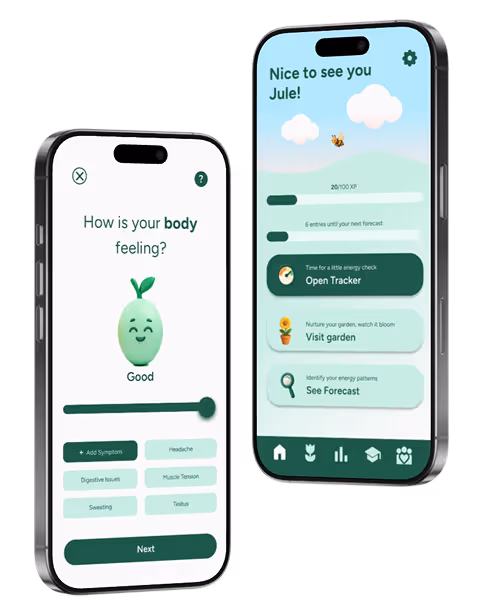
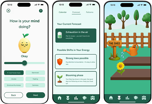
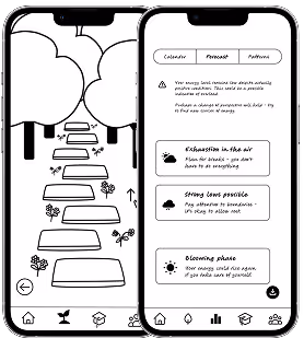
1. Three-Step Energy Tracker – low threshold, fast, suitable for everyday use.
2. AI Energy Forecast – helps predict energy highs and lows.
3. Playful Garden – visualizes progress without pressure or gamification stressIterative testing led to a clearer information hierarchy, less cognitive load, and a calm, friendly experience.
🎨 The Look
The branding combines natural green tones, warm accents, and organic shapes, supported by 3D illustrations for warmth and depth. The “Figtree” typography creates clarity and accessibility. The design conveys calm, growth, and self-care.
📊 The Results
In several rounds of testing (6 users):
5/6 would use Olive weekly or more often.
6/6 found the interface calming and emotionally supportive.
4/6 felt motivated by the tracker + garden, without pressure.
6/6 showed great interest in continuing to use the AI forecast in the long term.
🤔 Reflection
The project showed that empathy is the most important design skill — especially for people with limited energy. I learned that gamification does not automatically motivate and that emotional security counts for more than reward mechanisms. Olive was shaped by iterations, through mistakes, through listening, through learning. Design is a continuous learning journey, not a linear solution.
"Why can’t I be more consistent?"
That sentence stuck with me. Told, not from people lacking discipline, but from those living with fatigue, ADHD, or chronic pain. Having faced similar challenges, I understood the frustration of health tools that become yet another task. Most tracking apps demand routines and constant input — impossible when your body or mind won’t cooperate.
In order to design a truly helpful energy tracker, I needed to understand how people with chronic conditions experience, interpret and respond to changes in their energy levels. Through qualitative interviews and a quantative survey, I uncovered emotional and behavioural needs and frictions for my future users
1. How did they perceive energy shifts?
2. How do they idetify patterns right and what do they need to do better identify their own energy patterns?
3. What are early signs of energy loss?What do they expect from an digital product to actually fit their needs?
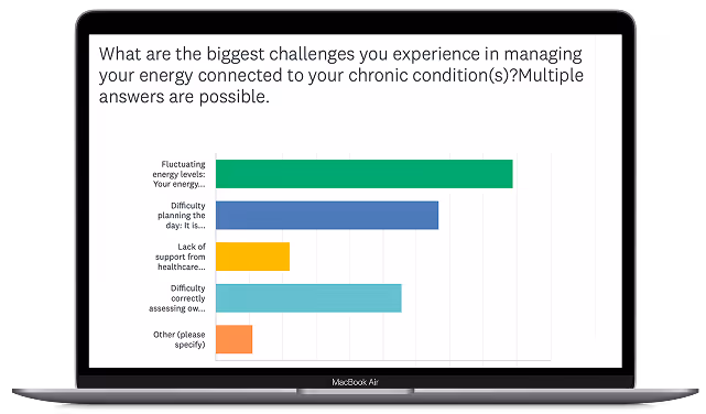
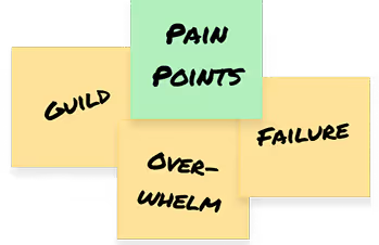
To design a truly supportive energy tracker, I needed to understand how people with chronic conditions perceive and respond to changes in their energy. Through qualitative interviews and a quantitative survey, I explored how users notice energy shifts, recognize patterns, detect early signs of fatigue. What do they expect from a product that truly fits their needs? Using affinity mapping, I organized and synthesized qualitative data to reveal recurring topics, pain points, and opportunities. Empathy mapping then deepened this understanding, highlighting emotional nuances such as guilt, frustration, and the desire for gentleness. These Insights shaped a calm, supportive, and compassionate design approach.


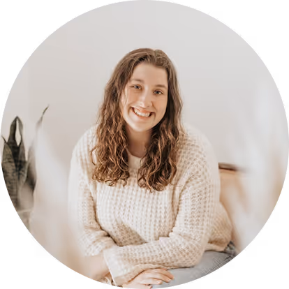
To really understand who I am designing for, I created personas that represent the people behind our users. Lena is one of them.
Lena is a 29-year-old freelance artist from Berlin living with ADHD and depression. Her energy levels are unpredictable and fluctuate. She often feels guilty for not being “productive enough” and wants a way to track her capacity. Not to optimize performance, but to better plan her life and treat herself with kindness.
“I want to understand and respect my energy and focus cycles so that I can be productive during highs and rest without guilt during lows."
Research revealed three key elements for Olive: A simple three-step tracker that fits effortlessly into daily life, an AI-powered energy forecast to anticipate low-energy periods and a playful garden that encourages progress gently, without pressure.
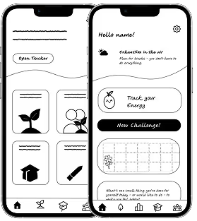
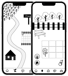
The design iteration progressed from low to mid to high fidelity, exploring numerous ideas and approaches along the way. Constant user testing during the wireframing stage enabled me to quickly identify what worked and what didn’t. This led me to discover the right direction for the product before investing heavily in visual and interactive details.
Three shades of green define the brand’s character, symbolizing growth, balance, and renewal. Orange tones add liveliness, while soft apricot provides friendly highlights. Together with light yellow, these colors also serve as tracker signals: green for positive states, yellow for neutral, and orange for low-energy moments.


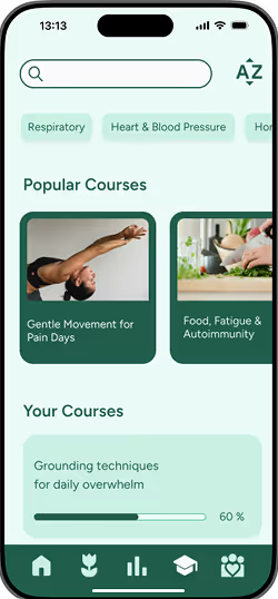
The typography uses the font “Figtree” to create a clear, friendly, and readable experience on mobile. Figtree is a modern, geometric sans-serif font with a approachable character. Its clean lines and balanced proportions make it highly legible at small sizes, while its subtle personality creates an inviting interface.

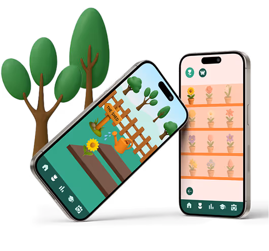
Olive’s iconography combines a clear design with a playful touch to support both navigation and engagement. Navigation icons are simple, flat, and familiar, using recognizable symbols to ensure intuitive usability.In contrast the garden illustrations, and all interactive components of the tracker are rendered as colorful, 3D illustrations. This creates a charming forest-and-meadow aesthetic. It also adds depth, personality, and delight to the interface while keeping functional elements clear and accessible.
To evaluate Olive’s design, I conducted usability testing with six users, observing not just feature usage but emotional responses. A second and third round revealed how well the design supported their daily energy management.
✅
5/6 users would use the app weekly or more
✅
6/6 users described the interface as relaxing and emotional supportive
✅
4/6 users evaluate Tracker & Garden as motivating, without pressure
✅
6/6 users expressed strong interest in continuing to use the AI forecast
🖐️
Forecast needs more micro-guidance to improve understanding
🪴
Clear instructions and visual feedback to ensure that the garden won't "die" if one or more days are skipped.
🕖
Longer test phase for realistic routines (Contextual Inquiry and Experience Sampling)
Working on Olive taught me the importance of designing with empathy at every step. Early testing made me realize that what feels playful to me as a designer can create pressure or confusion for users. Traditional gamification might not be a one-fits-all motivation. True impact comes from creating moments of connection, self-reflection, and emotional safety. Each iteration and insight challenged my assumptions and pushed me to listen more deeply, adapt thoughtfully, and embrace mistakes as part of the process. Through Olive, I discovered that mindful, user-centered design isn’t about perfection — it’s about growing alongside the people you’re designing for.