Go back

UX/UI Designer (solo)
July – September 2025
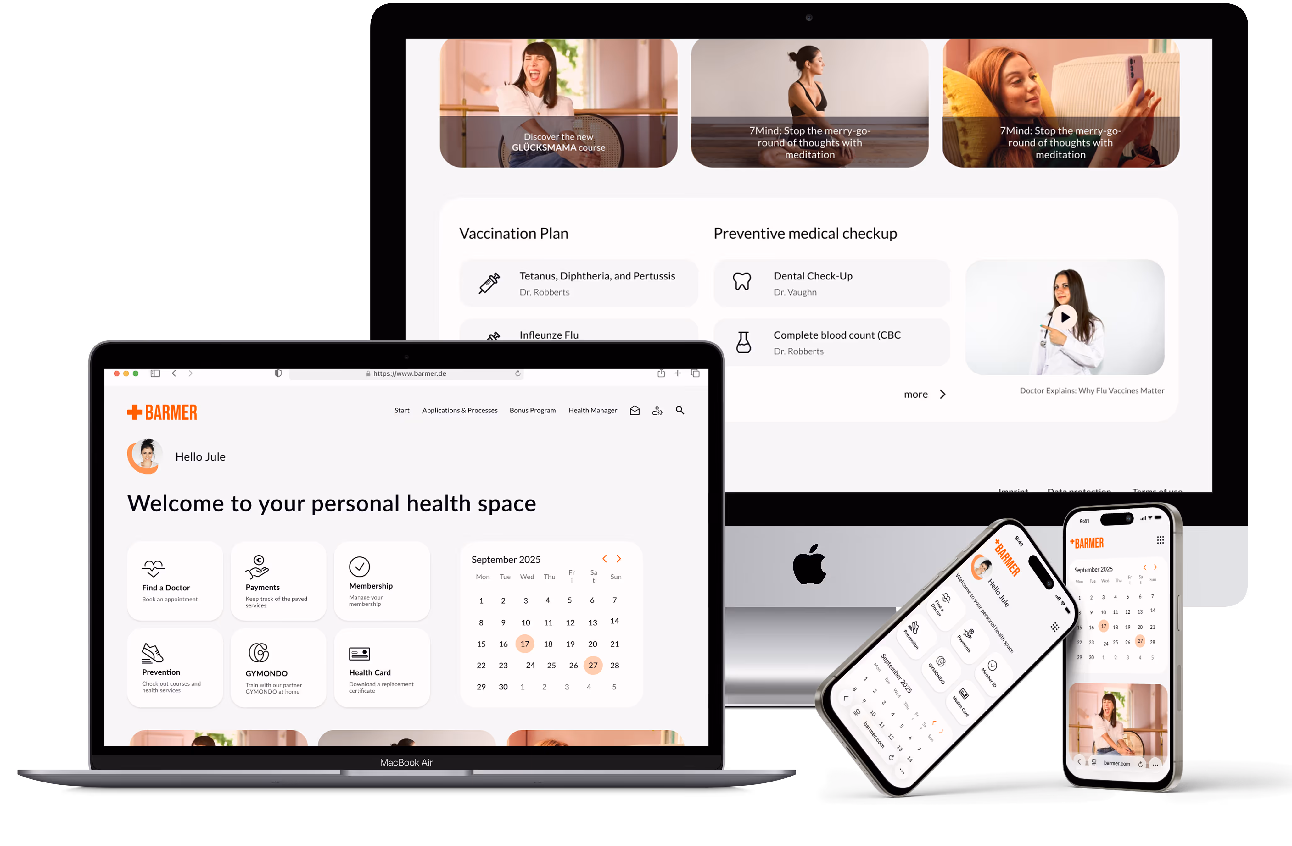
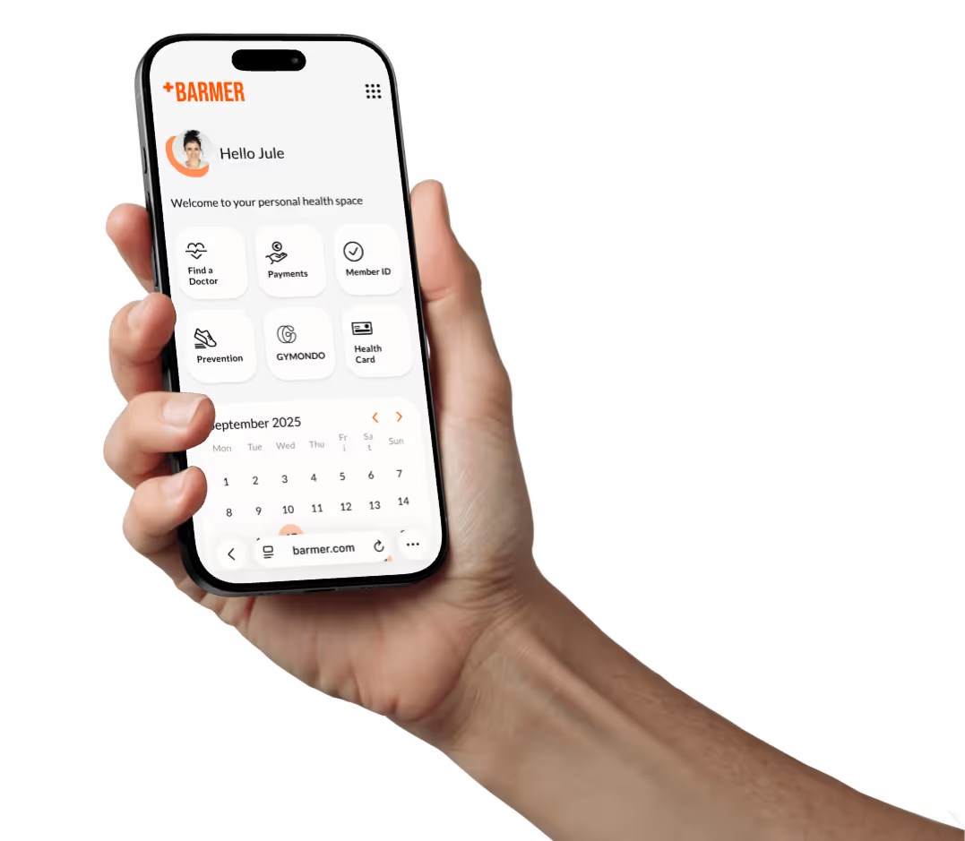
Good health matters to everyone — and so does great healthcare. As an insurance company, you have the opportunity to truly support your members at every step of their journey, whether they’re heading to the doctor or taking care of their health from the comfort of home. This is an approach on redesigning a health insurance web app to built an responsive and intuitive experience.
35 %
Faster task completion
4/5
Testers reported clearer task navigation
60 %
Users reported accessibility improvements
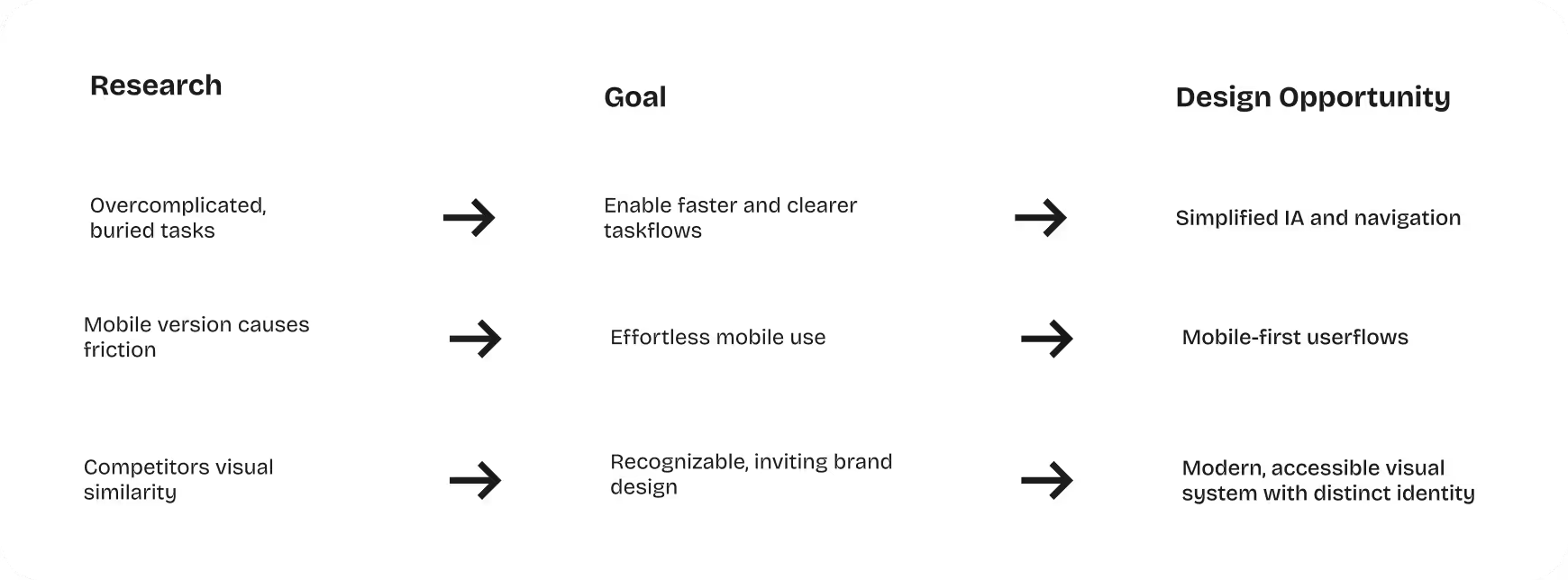
🎯 The Challenge
Barmer’s web app was cluttered, inconsistent, and hard to navigate—especially on mobile. Users struggled to find key features like applications, bonus programs, and doctor’s appointments. The challenge was to create a clearer, faster, and more trustworthy experience across all devices to meaningfully improve the digital health journey.
🛠️ The Approach
The process started with a deep analysis of the existing information architecture, supported by competitive insights and user research. Interviews, usability tests, and task analyses revealed consistent issues: too many navigation layers, inconsistent visuals, weak accessibility, and high friction on mobile. These findings guided a restructuring of core user flows, a reduction of navigation depth, and a shift to a mobile-first design.
💡 The Solution
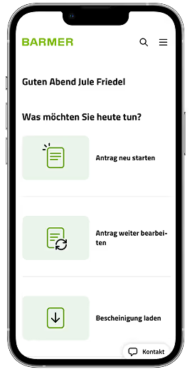
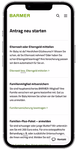
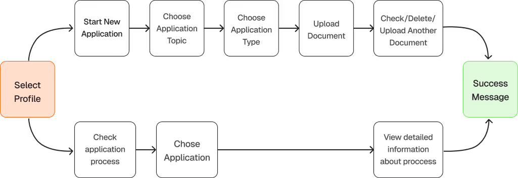
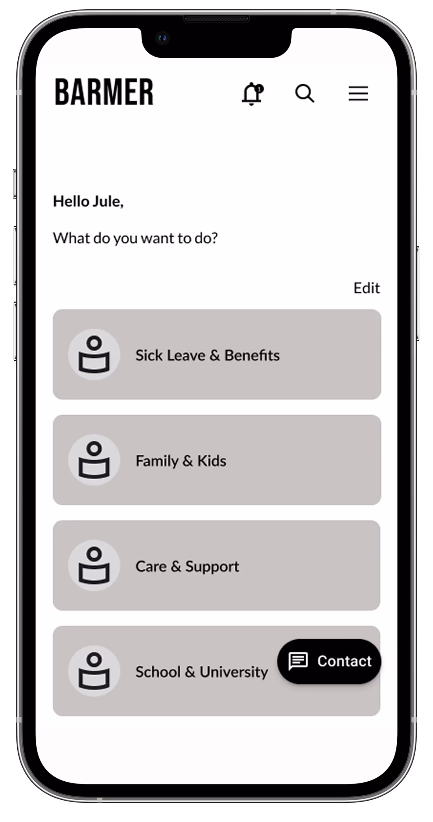
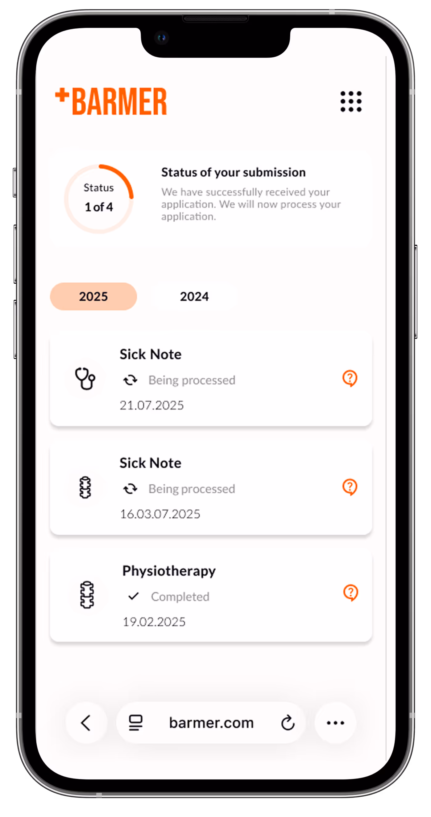
The solution emerged through iterative steps from low- to high-fidelity wireframes, focusing on clear navigation, simplified flows, and a more accessible visual system. The new IA, mobile-first patterns, and refined interactions reduce cognitive load and speed up tasks. Even complex actions—like applications or doctor’s appointments—can now be completed in just a few intuitive steps.
🎨 The Look
The new design uses a warm, modern visual system with bold oranges, soft grays, and clean typography. This palette sets Barmer apart from other insurers while meeting WCAG accessibility standards. Minimal icons, a consistent grid, and a responsive layout create an accessible, trustworthy, and human-centered experience across web and app.
📊 The Results
The redesign process led to measurable improvements: tasks were completed 35% faster, 4 out of 5 testers found navigation significantly clearer, and 60% reported noticeably better accessibility. In all tests, users knew immediately where to find information and described the new structure as calmer, more modern, and significantly easier to understand.
🤔 Reflection
The project demonstrated how significantly a clear redesign of navigation, layout, and design can improve user-friendliness. I learned how to combine clarity with emotional design and make the information structure understandable for mobile devices. In the process, I was able to further develop my skills in redesign, accessibility, and the design of user-friendly interfaces for complex healthcare services.
I redesigned Barmer’s web app with the goal of creating a clearer, faster, and more trustworthy user experience across every step of the digital journey. Drawing on extensive user insights and feedback, I refined the overall information architecture, optimized navigation paths, and streamlined key workflows to reduce friction and make essential health-related tasks easier to complete. In addition, I strengthened the visual design and branding to ensure a consistent, modern, and approachable feel across all devices. The result is a more intuitive, accessible, and seamless platform that supports users in managing their health with confidence and efficiency.
In analyzing the original design and its competitors, I first evaluated Barmer’s existing web app in terms of structure, clarity, and visual hierarchy. It became clear that key features were difficult to locate, navigation paths were unnecessarily long, and the visual language lacked consistency.
To get a complete picture, I then examined other healthcare products. There I found helpful best practices: clear dashboards, reduced navigation levels, and visual systems that build trust and facilitate orientation. At the same time, I noticed how similar many of these German health insurance designs looked—same color schemes, familiar patterns, little courage to differentiate.
These insights not only highlighted the weaknesses of the original design, but also opened my eyes to an opportunity: to create a more modern, accessible, and distinctive digital experience for Barmer.
“As a user, I want a simple and intuitive navigation structure that quickly guides me to common tasks like submitting applications or checking my bonus points so that I can use the website efficiently on the go without feeling overwhelmed.”
In the user research phase, I conducted interviews, usability tests, and task analyses to understand how real users navigate Barmer’s digital services. Participants consistently reported difficulties finding essential features such as applications, bonus points, or doctor search tools. Many felt overwhelmed by the amount of information and unsure which paths to follow, especially on mobile devices. The research also highlighted accessibility challenges, with users noting unclear labels, low contrast, and inconsistent visual cues.
With user goals defined, I mapped flows to minimize friction and steps for key tasks, paying special attention to mobile users so even complex actions like applications or appointments could be completed efficiently.
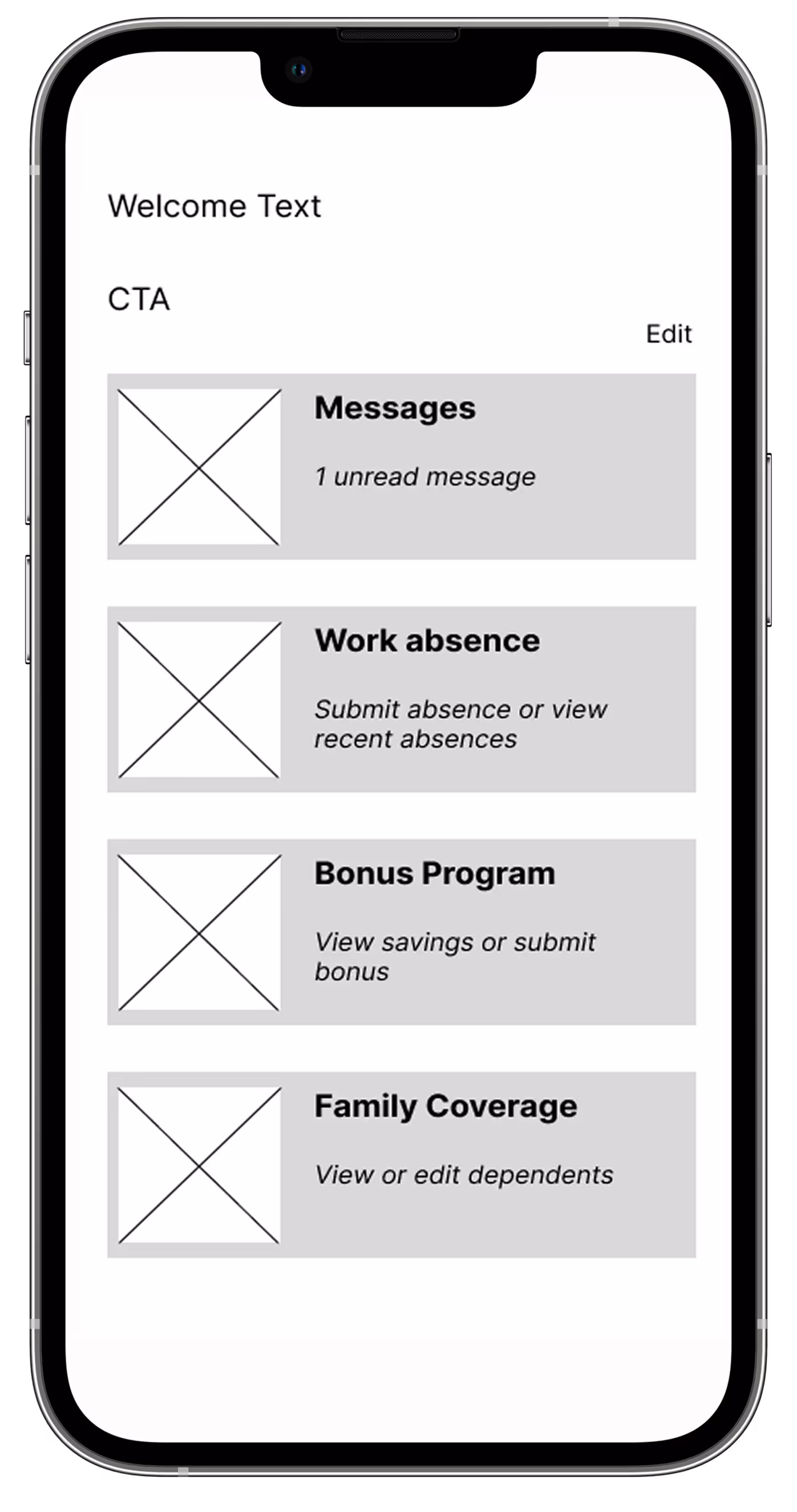
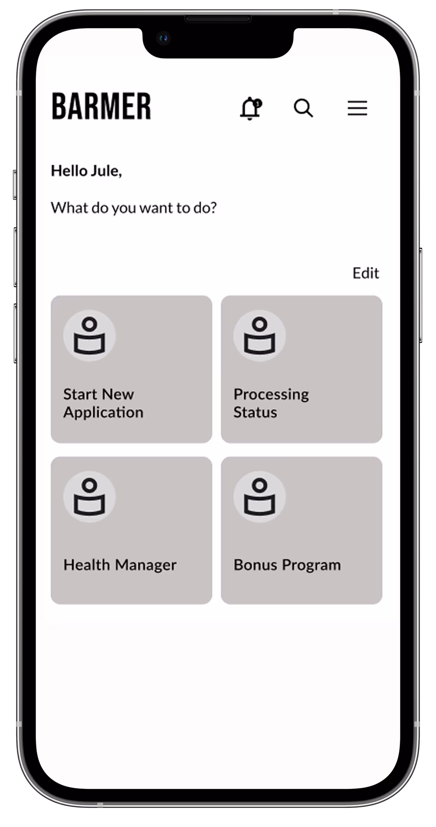
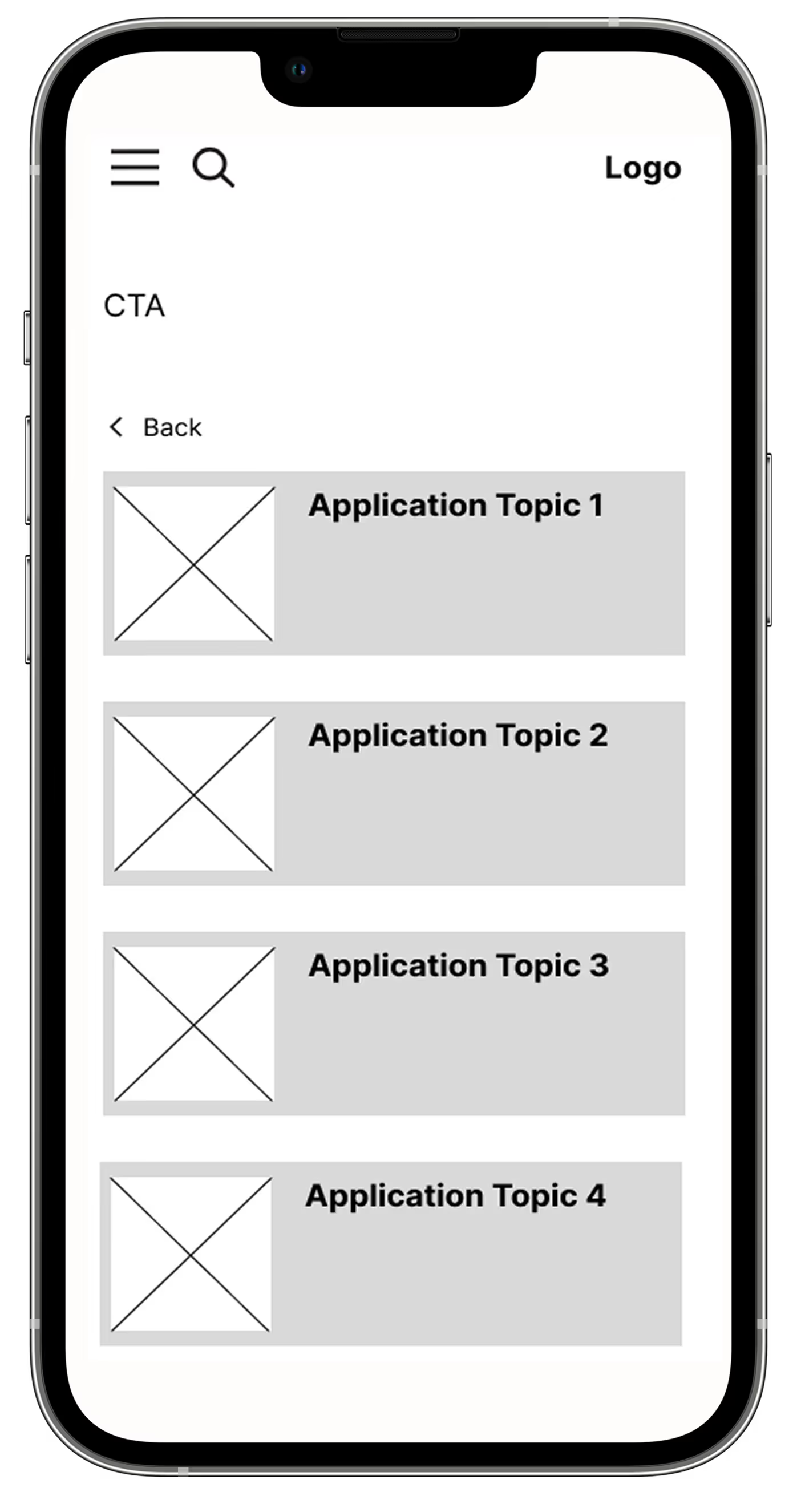
The design process went through several iterations, starting with low-fidelity wireframes to test basic layouts and information hierarchies, moving on to mid-fidelity wireframes to refine interactions and page structure, and finally to high-fidelity wireframes that captured the final visual concept. Each iteration made it possible to further improve layouts, interactions, and navigation and tailor them to user needs.
The design iteration progressed from low to mid to high fidelity, exploring numerous ideas and approaches along the way. Constant user testing during the wireframing stage enabled me to quickly identify what worked and what didn’t. This led me to discover the right direction for the product before investing heavily in visual and interactive details.
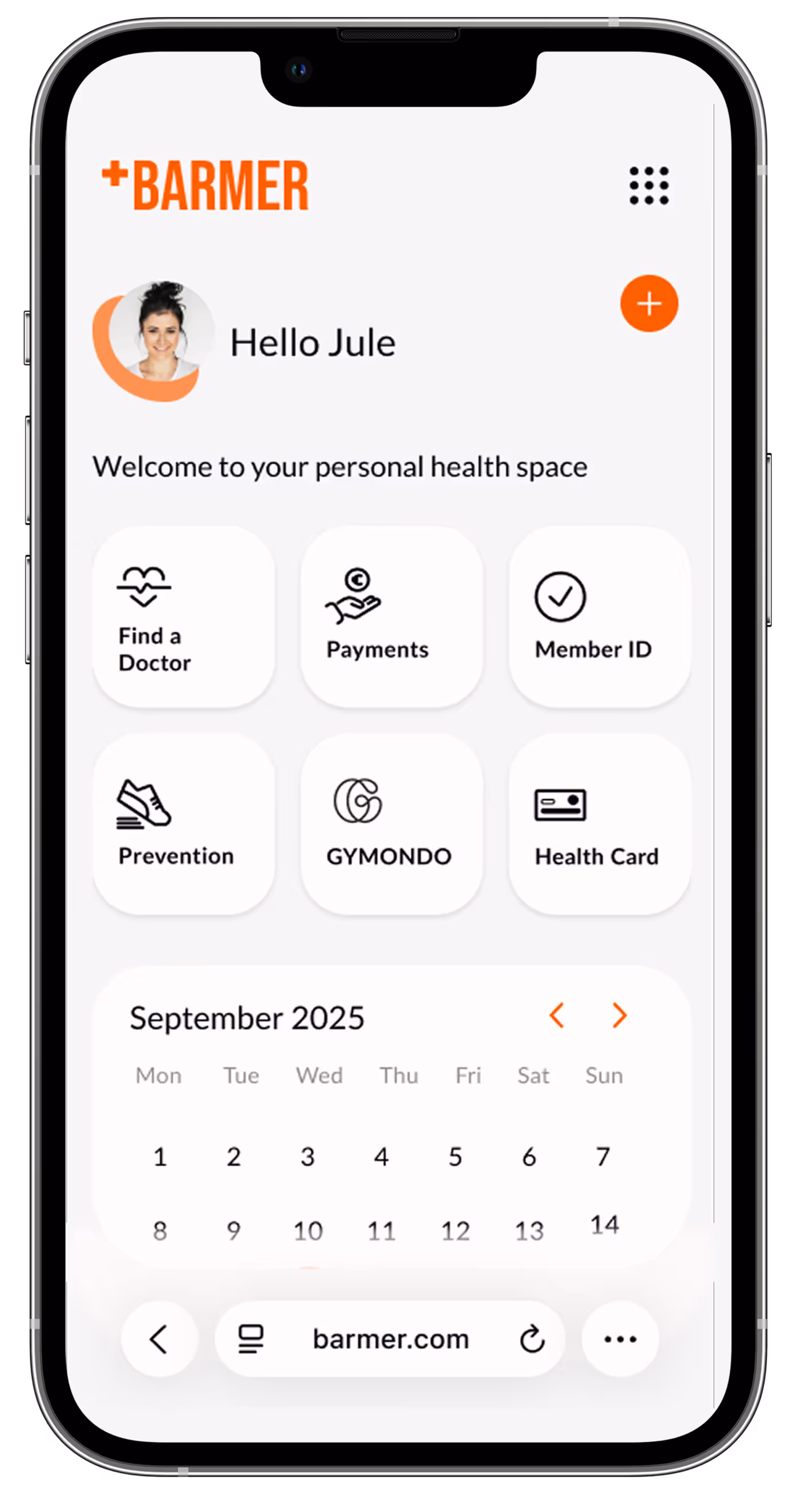
Barmer’s new visual language balances confidence with warmth, using bold colors, clean typography, and human-centered icons. The resulting style guide translates this attitude into a cohesive visual system — consistent across both app and web.
The visual identity uses warm orange tones with white and soft greys, replacing the typical green used by most other competitors, to better convey energy, optimism, and warmth. They were carefully chosen to meet at least AA level WCAG contrast standards. Subtle tonal variations add depth while keeping the interface consistent, harmonious, and inviting.


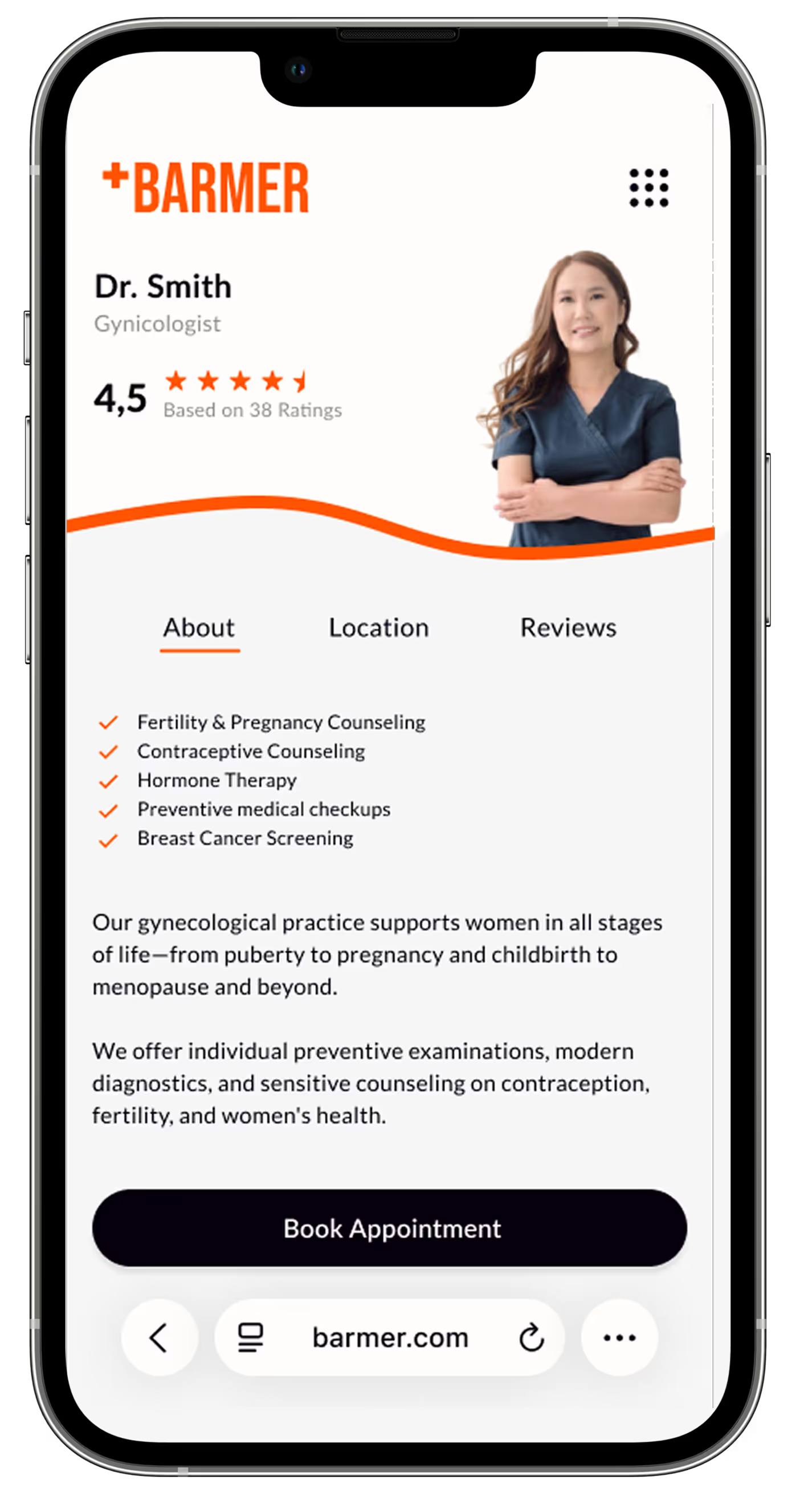
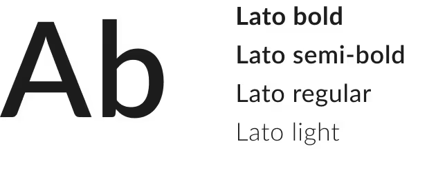
The typography, Lato, ensures clarity and readability with clean, neutral, and well-proportioned letters. Body text is 16 px, headlines scale from 24 px (mobile) to 48 px (desktop), and spacing adapts across devices, creating a clean, open, and inviting layout.
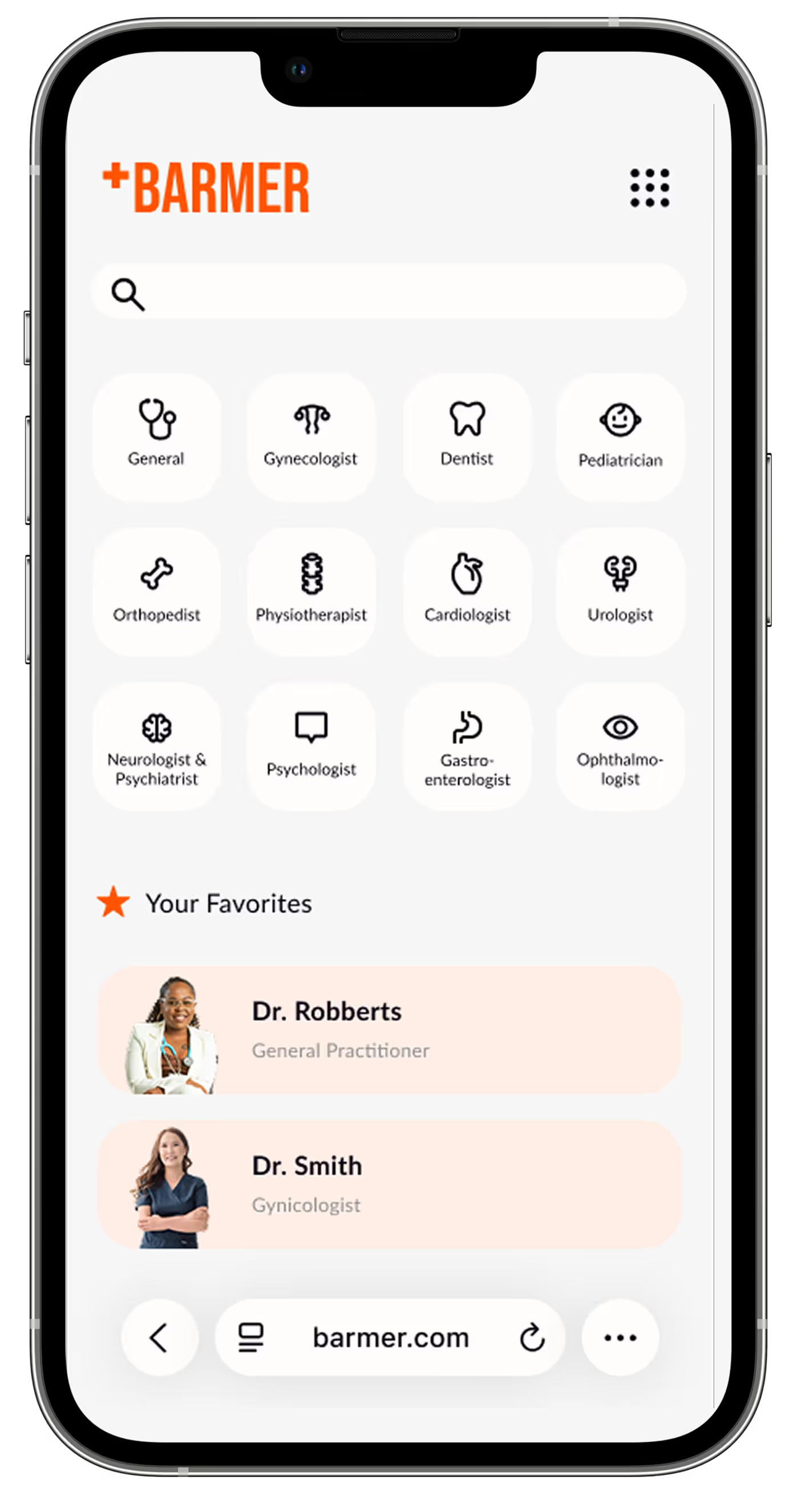
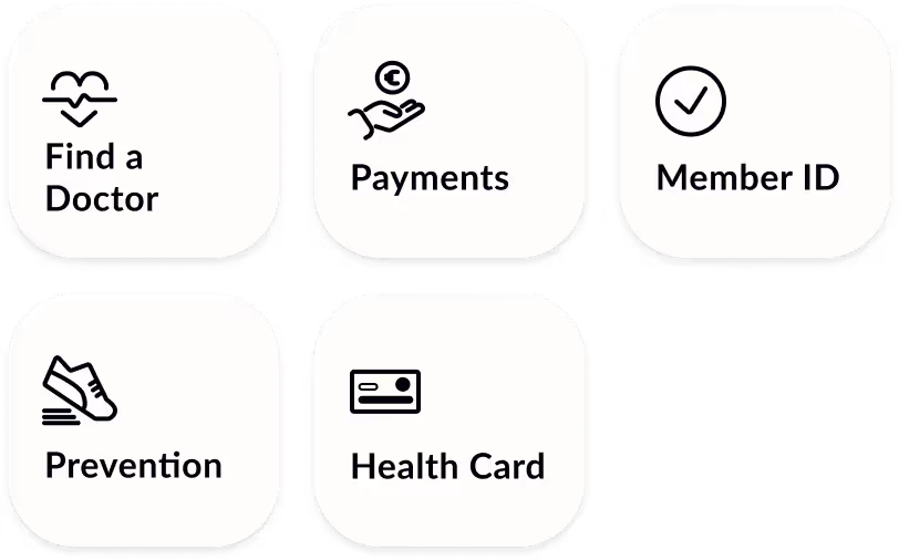
A set of flat, minimalist icons was chosen to enable clear, modern, and easy-to-understand user guidance. The minimalist style gives the symbols a friendly feel, which builds trust and does not overwhelm the user with unnecessary details. At the same time, the icons support quick visual orientation, so that important functions such as submitting documents, or health related services can be recognized at a glance. The color black guarantees maximal visibility and contrast.
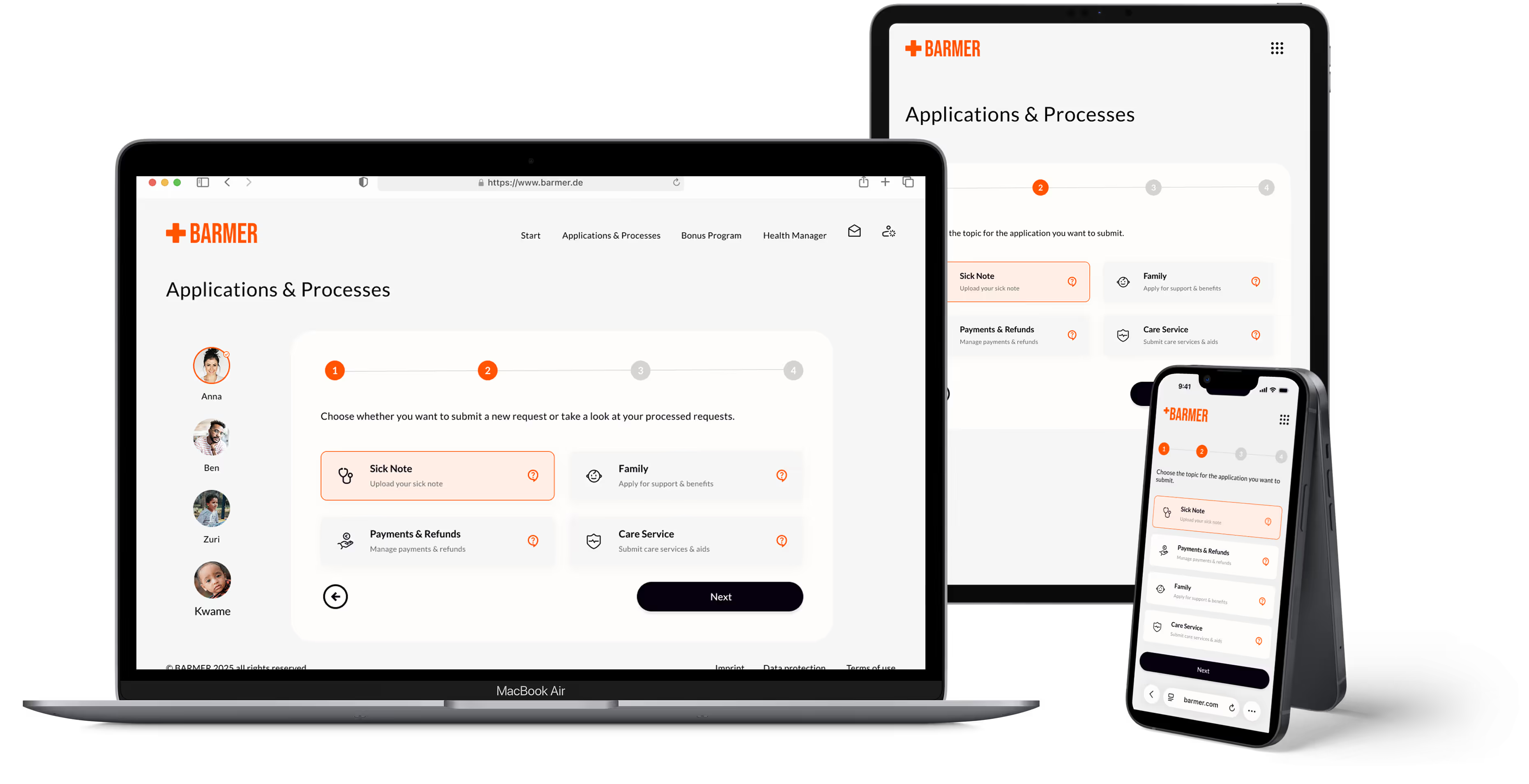
To meet diverse user needs, the layout system was built on Foundation’s responsive breakpoints and then refined for real-world scenarios. Layouts were built on a responsive column grid, adapting to screen size while maintaining consistent margins and gutters.
Components, typography, and spacing scale fluidly to maintain hierarchy, clarity, and accessibility across devices. By adapting Foundation’s base system, the design ensures consistency and flexibility—from quick on-the-go actions to complex desktop tasks.
User testing with five participants showed the redesign made the app more intuitive, accessible, and task-focused. Key actions were completed 35% faster, navigation issues were resolved, and all testers reported they knew exactly where to find information. Consistent layout, icons, and high-contrast colors improved accessibility, with three participants noting easier-to-read text and buttons.
✅
Key actions were completed 35% faster.
✅
Navigation problems were solved for 4 out of 5 users.
✅
All testers reported finding information without difficulty.
Redesigning Barmer taught me how much impact a complete rethink of navigation and layout can have on usability. I learned to balance clarity with warmth, ensuring every workflow and interaction feels intuitive, while keeping accessibility and consistency front of mind. realized that leading a full-scale redesign deepened my skills in problem-solving and user understanding. Most importantly, it strengthened my skills in interface design, from crafting clear layouts and hierarchies to designing interactions that feel human and empowering.