Go back

🎯 The Challenge
HR teams juggle many parallel tasks across fragmented tools, often lacking a clear overview. This leads to stress, inefficiency, and a loss of control over essential activities like vacation management, appointments, and recruitment.
🛠️ The Approach
Within a tight three-day design challenge, a fast and focused research phase was conducted, including a short interview, pain point analysis, and dashboard benchmarking. The goal was to quickly understand real user needs and prioritize what matters most.
💡 The Solution
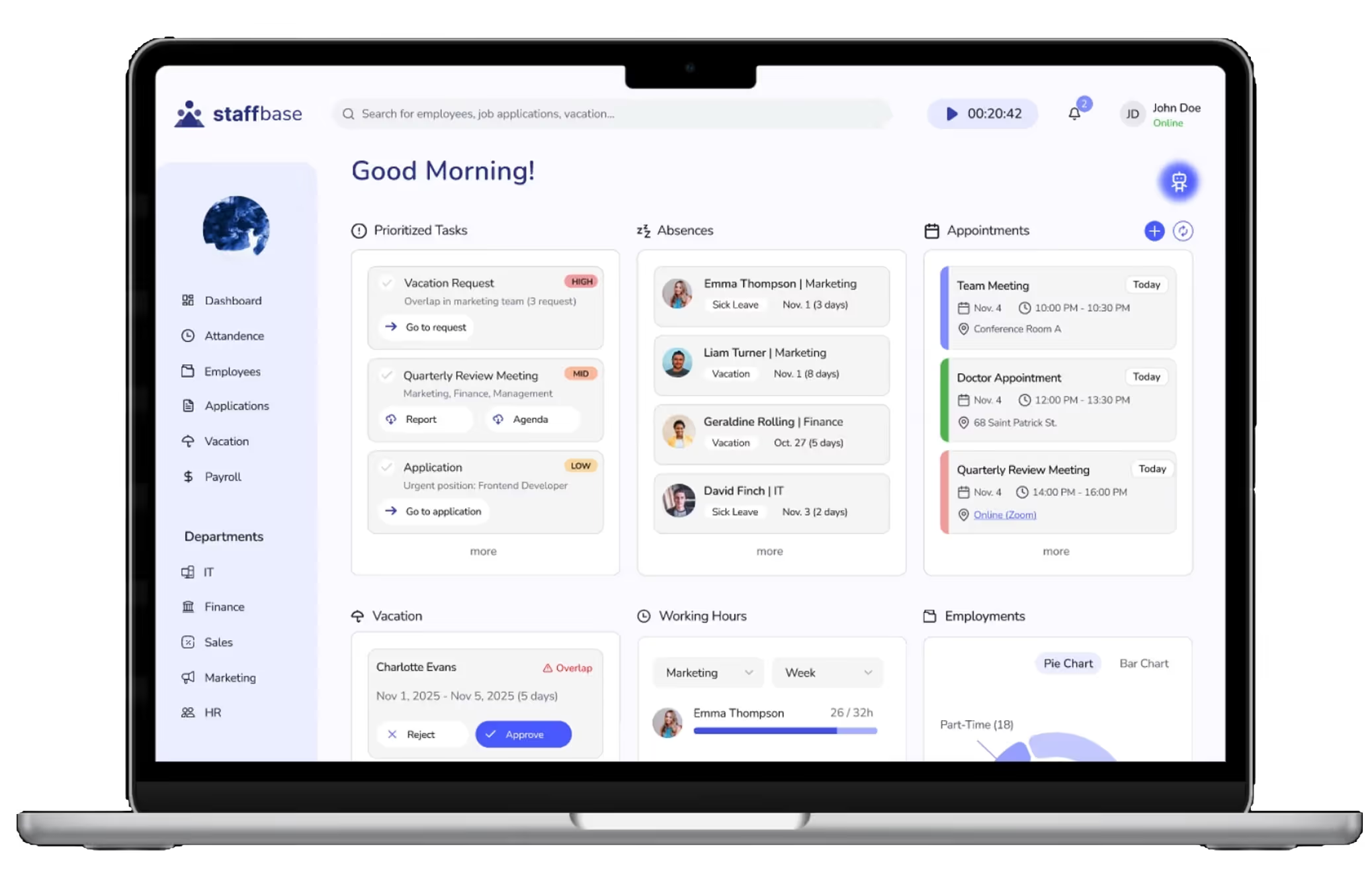
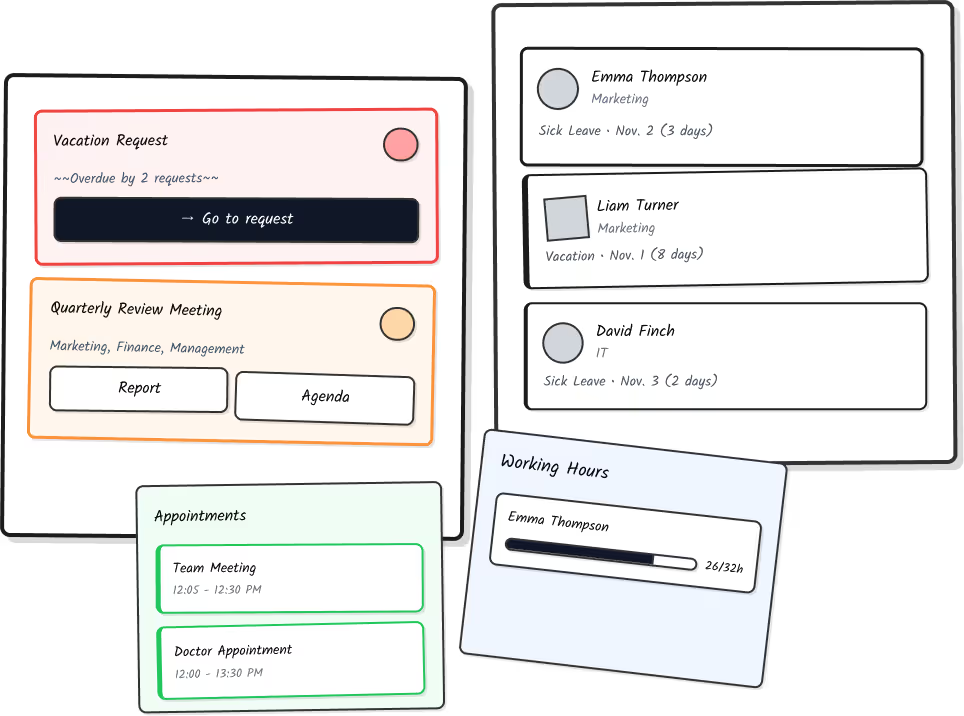
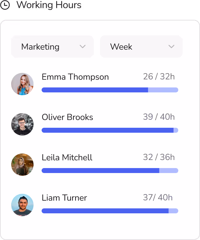
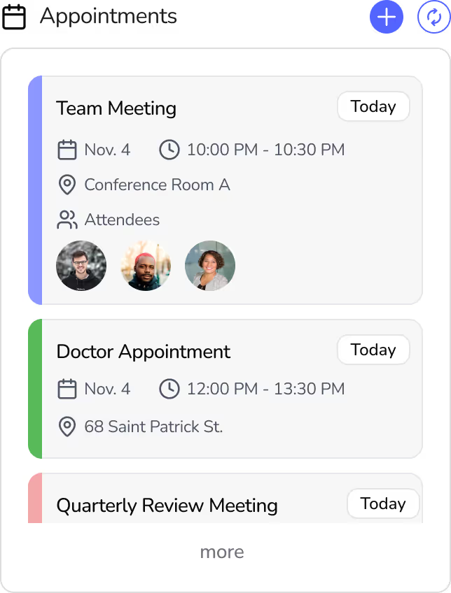
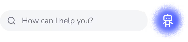
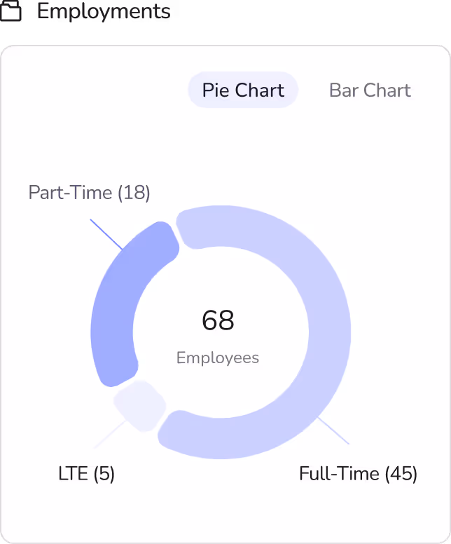
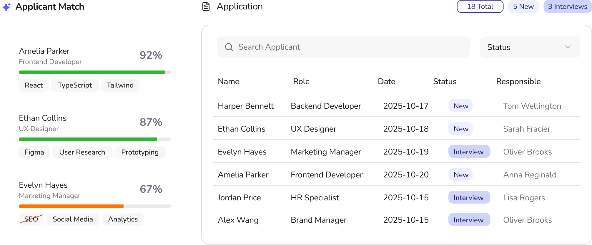
The result is a centralized HR dashboard that brings all core tasks into one place — from vacation and appointment management to working hours and recruiting. Clear hierarchies, simplified workflows, and AI-supported features enable efficient daily work.
🎨 The Look
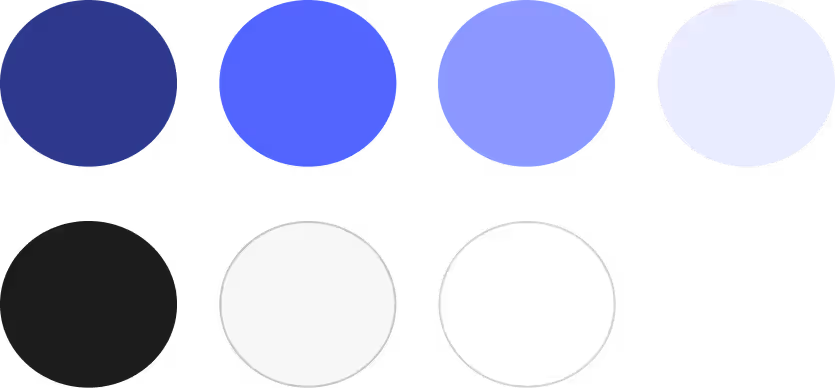
A calm, monochromatic blue color palette conveys trust and clarity. Clean typography (Lato), minimal iconography, and purposeful signal colors ensure readability, quick orientation, and a modern, professional feel.
📊 The Results
HR professionals gain a clear, visual overview of their work and can make faster, more confident decisions. AI-powered tools like applicant matching and a navigation chatbot reduce friction and save time.
🤔 Reflection
The project highlighted the value of focus, rapid iteration, and early feedback. It reinforced that strong UX design is about clarity over complexity — and that AI can meaningfully accelerate the process when human needs remain at the center.
HR teams are often the quiet backbone of organizations, yet their work can feel overwhelming and invisible. They manage numerous tasks, from vacation requests and appointments to tracking employee information, often without a clear overview.
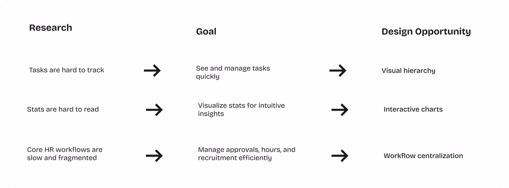
Given the tight three-day timeframe, a rapid, focused research phase was conducted to understand HR professionals’ most pressing challenges. This included a quick interview with an HR team member, reviewing common pain points in task management, and analyzing existing dashboards for inspiration. Insights revealed that HR employees often struggle to keep track of tasks, deadlines, and employee information without a clear overview.
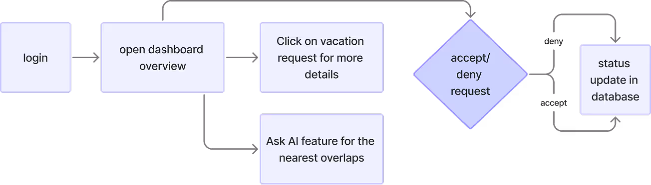
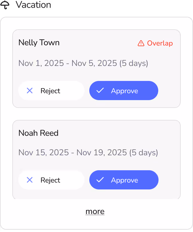
The research phase focused on understanding the daily challenges of HR professionals. It showed that tasks like vacation requests, appointment management, and staff overviews are often time-consuming and fragmented. One key need was a simple, fast way to manage vacation requests. The following user flow illustrates how an HR employee can handle such a request directly from the dashboard.
Based on the research insights, the concept evolved into a centralized HR dashboardt hat brings together all essential information and functionalities in one place. The goal was to create a clear and efficient workspace where HR professionals can manage their daily responsibilities with ease.
To support this, key features were prioritized to cover the most important aspects of HR workflows:
The design process followed a rapid iterative approach, moving from low-fidelity sketches to a interactive high-fidelity prototype within the three-day challenge. Early low-fidelity wireframes focused information hierarchy and core functionality, such as task management, vacation requests, and appointment tracking. To explore options more quickly in the early stages, I used Figma Make AI to generate alternative layout variants. The ideas served as a sparring partner, but I deliberately rebuilt the final wireframes and curated their content.
Feedback from a second round of user testing revealed adjustments, leading to iteration with improved visual hierarchy, clearer labeling, and better organization of workflows. Finally, the high-fidelity version refined the visual design, added color coding, interactive charts, and AI-assisted features, while maintaining simplicity and usability.
For example, the calendar view was omitted after testing in order to focus more on the functionality of the appointment overview. The feature for tracking your own working time was also moved from the main dashboard to the top bar to create more space for organizational tasks.
Additionally, the use of colors such as green, orange and red was refined through feedback rounds so that, ultimately, the intended message of the signal colors was conveyed without overwhelming the user with too many color combinations.
The dashboard’s visual design was crafted to be clean, modern, and user-friendly. Amonochromatic blue palettewith multiple shades provides a sense of calm, trust, and professionalism, while also helping users focus on key information without visual clutter.
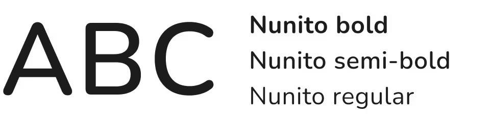
The Nunito font is particularly well suited for an HR dashboard, as its rounded, clear letters ensure high readability even at small font sizes and with dense information presentation. At the same time, it conveys a modern, friendly impression that makes the dashboard appear professional yet accessible.
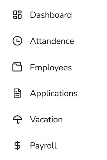
The minimal, flat line icons complement the typography by adding subtle yet meaningful visual cues that guide the user’s attention without drawing focus away from the core content. Their clean, understated aesthetic supports the overall structure of the dashboard, ensuring that navigation and interaction remain intuitive and visually balanced. By avoiding unnecessary ornamentation, the icons contribute to a cohesive and uncluttered visual language that enhances clarity, strengthens usability, and maintains a harmonious relationship between text and imagery throughout the entire interface.
The three-day challenge resulted in a high-fidelity HR dashboard that gives HR professionals back what modern workflows often take away: clarity, calm, and control. By centralizing daily tasks, appointments, vacation requests, working hours, employment statistics, and recruitment processes, the dashboard allows users to see everything at a glance and act quickly. AI-powered features, like the applicant compatibility tool and the navigation chatbot, help reduce friction and support faster, confident decision-making. Thoughtful choices in color, typography, and iconography create a professional yet approachable interface, making complex HR workflows feel intuitive and manageable.
Working within a tight three-day timeframe taught me how to move quickly from research to a polished prototype while keeping the user at the center. I learned to prioritize features that truly matter, iterate based on early feedback, and make design decisions that balance clarity, usability, and visual harmony. Using Figma Make AI for rapid concepting showed me how AI can accelerate the design process without sacrificing empathy or quality. Most importantly, this project reinforced the value of understanding users’ real challenges — by designing for HR professionals’ needs, I was able to create a tool that not only looks clean and modern but genuinely helps them focus on what matters most: people.